The Brief
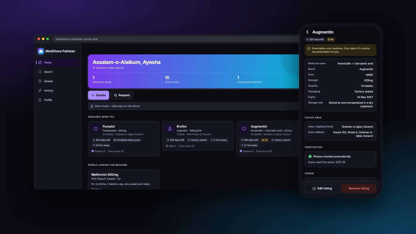
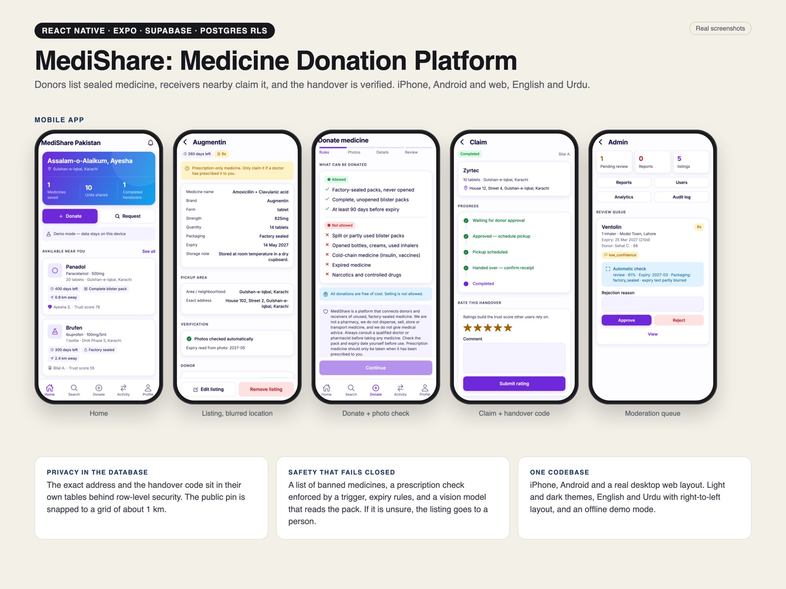
Take a product spec for a community medicine-sharing platform and ship the whole of it: donors list sealed medicine they will not finish, receivers search nearby, the two meet, the handover is verified, and a moderator can see everything that moved. One codebase, iPhone and Android and a real desktop web app, in English and Urdu, for a market where a text message costs money and a lot of users are on a mid-range Android.
The product question underneath it is trust. A medicine marketplace fails in two directions: it fails if people will not give their address to a stranger, and it fails much worse if it becomes a channel for expired or prescription-only drugs. Almost every engineering decision here answers one of those two.
Privacy Enforced in the Database, Not the Interface
The tempting shortcut is to fetch the listing with the donor's address attached and simply not render the address until a claim is approved. That is not privacy: that is a hidden div, and anyone reading the network tab has the address.
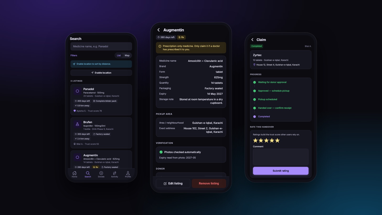
Instead, the exact address and the handover code live in their own tables with their own row-level security policies. The listing table carries only a neighbourhood and a coordinate deliberately blurred to roughly a one-kilometre grid, which is enough to sort by distance and not enough to find a house. The precise address becomes readable to exactly one receiver at exactly one moment: when the donor approves that person's claim. The server decides. The client never had it to hide.
The Handover Is the Product
Everything before the meeting is a search problem. The meeting is where the platform either earns trust or loses it, so it is the part that got the most attention.
A claim moves through explicit states (requested, approved, pickup scheduled, handed over, completed) and each transition is a database function rather than a client-side status write, so a step cannot be skipped by a crafted request. At the meeting, the receiver shows a six-digit code, also rendered as a QR so nobody has to read digits aloud in a stairwell, and the donor confirms it. Both sides then rate the exchange, and those ratings feed a visible trust score that is the only reputation signal in the product.
Safety Rails That Fail Closed
A donation platform that treats every medicine the same is a liability. This one does not.
- A prohibited list that blocks controlled and high-risk categories at listing time, held in the database so it can be updated without shipping an app release.
- A prescription gate (a database trigger, not a form validation) that refuses to complete a claim on a prescription-only medicine unless a prescription photo is attached.
- Expiry rules applied at listing, with the remaining shelf life shown on every card so a receiver is never surprised.
- Photo verification using a vision model in an edge function, which reads the pack for the medicine name, strength and printed expiry and compares them against what the donor typed.
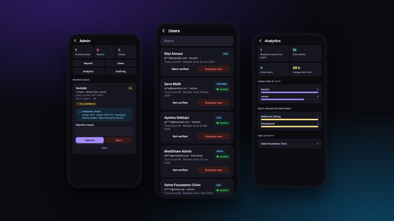
The last one is where it would have been easy to cheat. When the model is unavailable or unsure, the listing does not quietly pass and it does not claim a check that never happened. It goes to the human review queue labelled as unverified. An automatic check that fails open is worse than no automatic check, because it launders a guess into a badge.
Every safety rule in this product is enforced on the server. A rule that only exists in the app is a suggestion, and it stops applying the moment someone talks to the API directly.
A Cost Decision That Changed the Architecture
The original design signed users in by SMS one-time code. In Pakistan every one of those messages is billed, which turns sign-up (the one action you want to be frictionless) into a per-user cost that scales with the exact thing you are trying to grow.
So sign-in became channel-aware. Email leads, because email codes cost nothing; phone stays available for people who do not use email. That is not a screen change: the client interface, both backends, the profile schema and the account-matching rules all had to stop assuming a phone number was the identity. One account per identifier, whichever channel it arrived on, with the other identifier backfilled if the user later adds it.
Two Backends Behind One Interface
The app talks to a single typed data client. One implementation is the real one, Postgres, row-level security, security-definer functions, storage, auth. The other keeps the entire product working on-device with seeded data and no network at all.
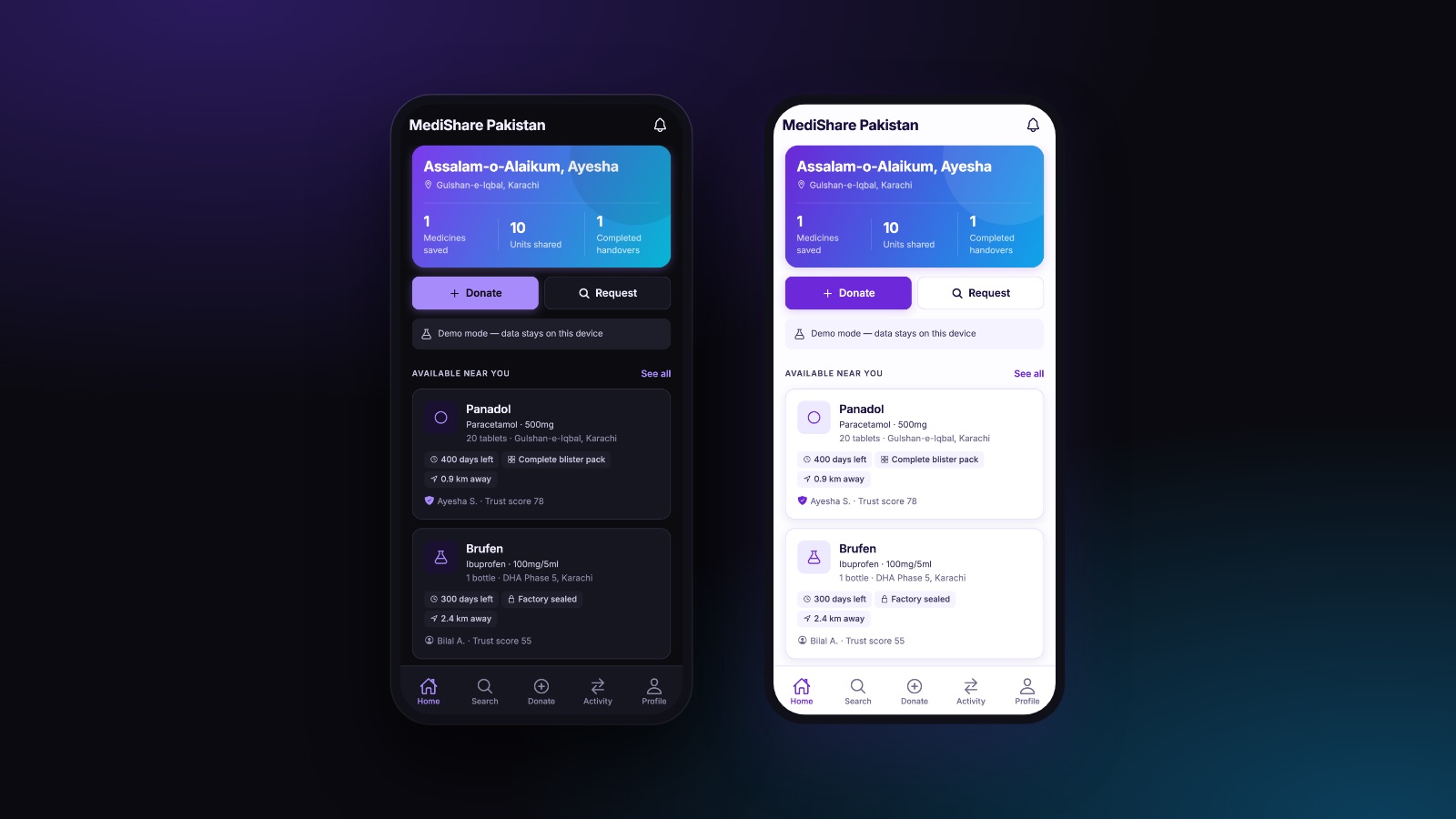
That second implementation is not a mock for tests. It is how the public demo runs, which means the product can be shown to a stakeholder on a phone in a meeting room with bad wifi, with no account, no cost, and no risk of a demo writing to real data. Because both implementations satisfy the same interface, the demo cannot drift away from the product. A feature that does not exist in both does not compile.
One Codebase, Not One Layout
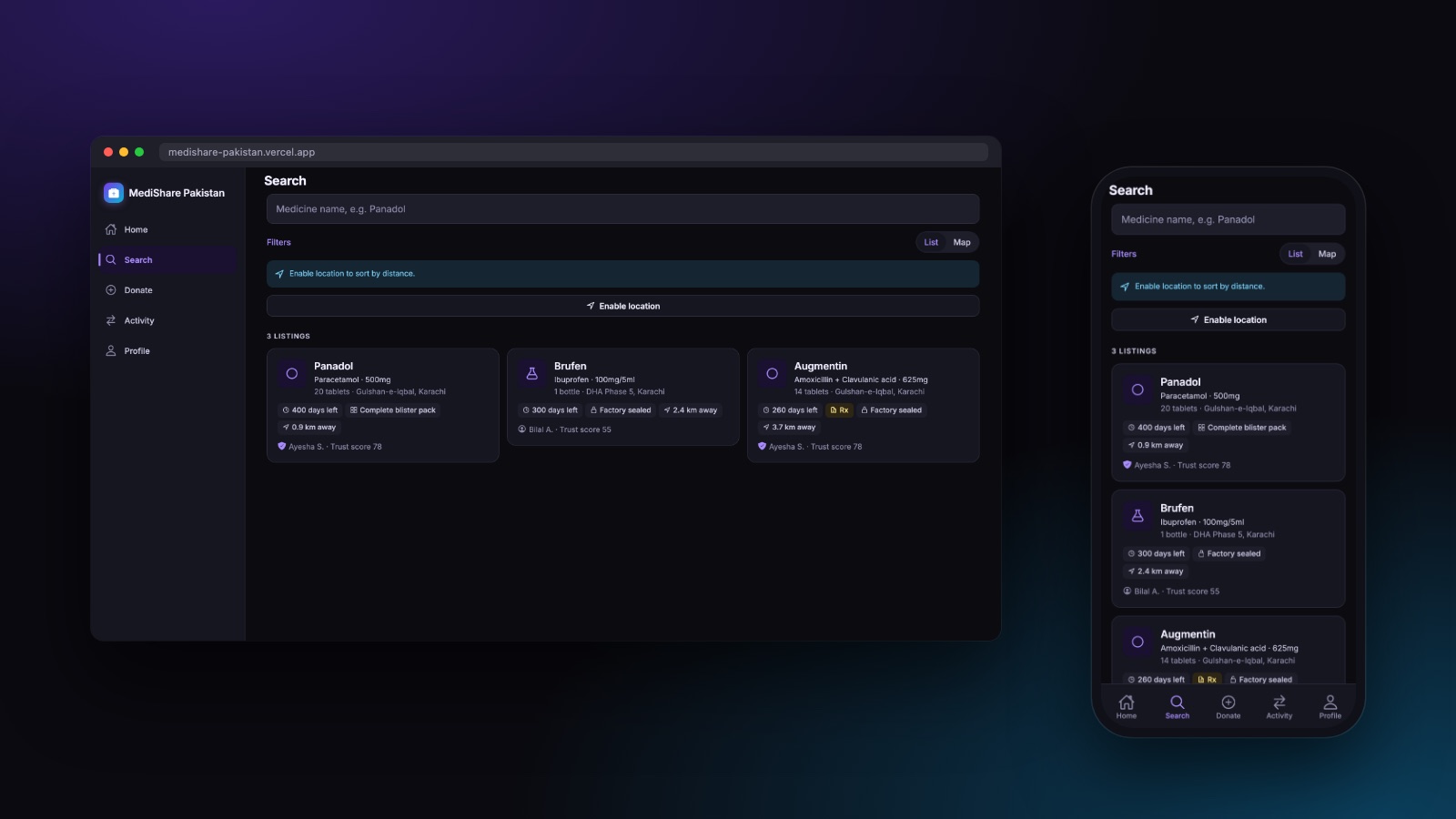
React Native for Web makes a phone app run in a browser. It does not make it a web app. A 375-pixel column stretched across a monitor reads as a port, not a product. The desktop build swaps the bottom tab bar for a persistent sidebar, moves lists into a real grid, and caps reading-width content so a paragraph is never 1400 pixels wide, from the same components. Light and dark are both first-class, and the whole interface mirrors correctly for Urdu.
Status and Honest Limits
What exists is a complete, working product build: the full donor-to-receiver journey, volunteer-assisted pickups, moderation, analytics, account deletion, and a live public demo. Two things are worth stating plainly rather than implying otherwise.
The public link runs in demo mode (real data stays on the device) so it is a product walkthrough, not a live service with users. And the cloud path, while fully written and migrated, has not yet carried production traffic; the first real deployment is where the interesting row-level-security edge cases usually surface, and that work is scoped, not finished. Everything above describes what is built, not what is promised.